Amoco
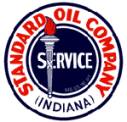
Standard Oil of Indiana began marketing in Vermont as American Oil (Amoco) in 1935.
In 1926, the first Amoco logo was developed, although it still boasted the Standard Oil of Indiana name. The logo featured a circle and the torch that would become synonymous with the Amoco brand.
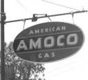
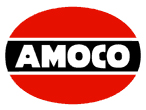
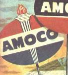
In 1932, the first Amoco logo that appeared in Vermont was developed. The design consisted of an oval divided into three sections, the top and bottom being red and the middle being black with white lettering. The 1932 logo had the words "American" and "Gas" above and below the logo, as seen in the image on the left. In 1954, the additional words were removed, leaving just the Amoco name.
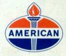
In 1956, the next logo was developed. It kept the divided oval shape and incorporated the torch from the original logo onto a red, white, and blue background. This logo and the 1954 logo were used simultaneously until 1961.
In 1961, the American replaced the Amoco name. The new logo closely resembled the previous logo, except with the American name.
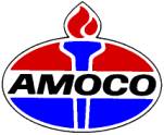
In 1971, the Amoco name returned. A new logo, which is still used today, simplified and modernized the torch and oval design.